Statistical Modelling in R
During my Master's year at university, I undertook a Statistics elective module, where I conducted data analysis and statistical modelling in MATLAB to predict space mission costs over time. Subsequently, I completed a professional development course in R and recreated this project to showcase my adaptability and proficiency with its libraries and functions.

Abstract
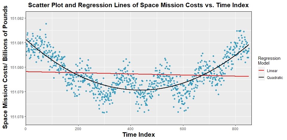
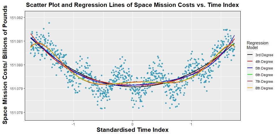
"This investigation focused on modelling the space mission costs in terms of the time index predictor variable by implementing and comparing different regression models, from a 1st degree (linear) model to an 8th degree polynomial.
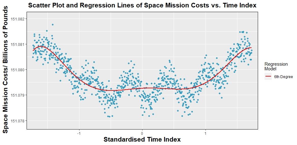
"A 6th degree polynomial regression model, which was then applied to a subset of the original data, was ultimately found to produce the best results by minimising the amount of information lost in the fitting process according to Akaike’s Information Criterion.
"A bootstrapping technique was also implemented which made it possible to calculate a 95% pointwise confidence band for the fitted response estimated from the data subset."
Below is a snippet of the code that was used for this task. I used the R statistical analysis package along with several of its useful libraries, including readr for data ingestion, dplyr for data cleaning and manipulation, ggplot2 for data visualisation, among others.
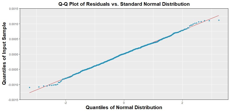
A sample of the plots generated for this project is shown in the gallery at the bottom of the page.
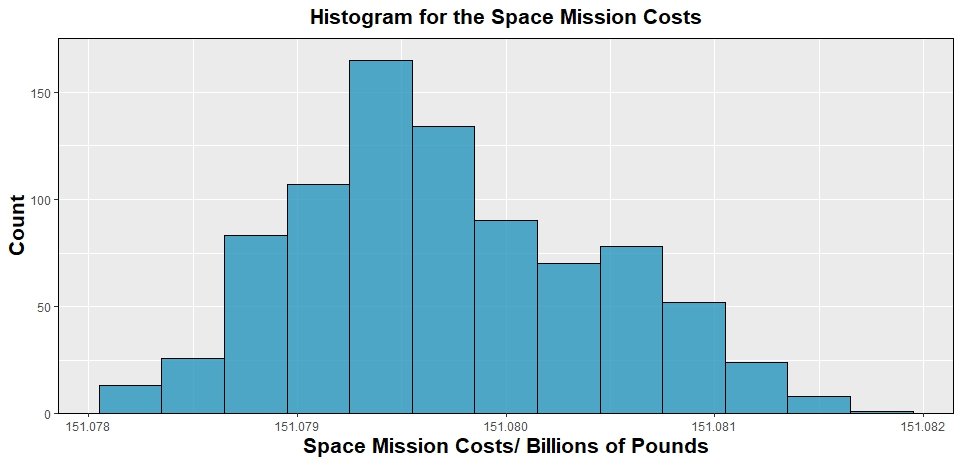
library(readr)   #Library to read csv files
library(dplyr)   #Library for data analysis
library(ggplot2) #Library for plotting visualisations

#Import the data
data <- read_csv('data1342785.csv')
head(data)

timeIndex <- data$X
cost <- data$Y

#Exploratory data analysis and histogram
costMean <- mean(cost)      #Mean cost
costMedian <- median(cost)  #Median cost
costTrimMean <- mean(cost, trim=0.1) #10% trimmed mean i.e. remove top and bottom 10% of data
costSTD <- sd(cost)         #Sample standard deviation

histogram <- data.frame(cost) %>%
  ggplot(aes(cost))+
  geom_histogram(bins=13,binwidth=0.0003,color='black', fill=rgb(37/256, 150/256, 190/256), alpha=0.8)+
  labs(title=expression(bold('Histogram for the Space Mission Costs')),
       x=expression(bold('Space Mission Costs/ Billions of Pounds')),
       y=expression(bold('Count')))+
  theme(panel.border = element_rect(colour = "black", fill=NA))+
  scale_y_continuous(expand = c(0, 0), limits = c(0, 175))+
  theme(plot.title = element_text(hjust = 0.5, size=16),
        axis.title=element_text(size=16))
histogram

#.
#.
#.

#Simple linear regression model
model1 <- lm(cost ~ timeIndex)  #Fit a linear regression model to the data

xlin1 <- seq(first(timeIndex), last(timeIndex), length.out=length(timeIndex)) #Create 851 equally spaced timeIndex points (851 because geom_line() below requires same number of points as original data in scatter)
y1_predicted <- predict(model1, list(timeIndex=xlin1))                    #Calculate predicted values of y (cost) based on the linear model fitted

scatter_poly1 <- data.frame(timeIndex) %>%
  ggplot(aes(x=timeIndex, y=cost))+
  geom_point(color=rgb(37/256, 150/256, 190/256), alpha=0.8)+
  labs(title=expression(bold('Scatter Plot and Regression Line of Space Mission Costs vs. Time Index')),
       x=expression(bold('Time Index')),
       y=expression(bold('Space Mission Costs/ Billions of Pounds')))+
  theme(panel.border = element_rect(colour = "black", fill=NA))+
  scale_y_continuous(expand = c(0, 0), limits = c(min(cost)-0.0005, max(cost)+0.0005))+
  scale_x_continuous(expand = c(0, 0), limits = c(0, max(timeIndex)+10))+
  geom_line(aes(y=y1_predicted), colour='red', linewidth=1)+
  theme(plot.title = element_text(hjust = 0.5, size=16),
        axis.title=element_text(size=16))
scatter_poly1

#Higher order polynomial fits were also calculated
#.
#.
#.

#Exploring error terms on 6th order polynomial model
residuals_6 <- model6$residuals

  #Are the errors independent? Are they centred at 0? Do they have constant
  #variance (i.e. 'width') across all x values?
scatter_residuals <- data.frame(stdTimeIndex) %>%
  ggplot(aes(x=stdTimeIndex, y=residuals_6))+
  geom_point(color=rgb(37/256, 150/256, 190/256), alpha=0.8)+
  labs(title=expression(bold('Scatter Plot of Residuals vs. Time Index')),
       x=expression(bold('Standardised Time Index')),
       y=expression(bold('Residuals/ Billions of Pounds')))+
  theme(panel.border = element_rect(colour = "black", fill=NA))+
  scale_y_continuous(expand = c(0, 0), limits = c(-0.0015, 0.0015))+
  scale_x_continuous(expand = c(0, 0), limits = c(min(stdTimeIndex)-0.1, max(stdTimeIndex)+0.1))+
  theme(plot.title = element_text(hjust = 0.5, size=16),
        axis.title=element_text(size=16))
scatter_residuals

#Are the errors normally distributed?
residuals_6_df <- data.frame(residuals_6)
qqplot <- residuals_6_df %>%
  ggplot(aes(sample=residuals_6))+
  stat_qq_line(color='red')+
  stat_qq(color=rgb(37/256, 150/256, 190/256), alpha=0.8)+
  labs(title=expression(bold('Q-Q Plot of Residuals vs. Standard Normal Distribution')),
       x=expression(bold('Quantiles of Normal Distribution')),
       y=expression(bold('Quantiles of Input Sample')))+
  theme(panel.border = element_rect(colour = "black", fill=NA))+
  scale_y_continuous(expand = c(0, 0), limits = c(-0.0015, 0.0015))+
  theme(plot.title = element_text(hjust = 0.5, size=16),
        axis.title=element_text(size=16))
qqplot

#.
#.
#.

#Fit 6th degree model on subset of data
stdTimeIndex_subset <- (timeIndex_subset-mean(timeIndex_subset))/sd(timeIndex_subset)
stdTimeIndex_subset_2 <- stdTimeIndex_subset^2
stdTimeIndex_subset_3 <- stdTimeIndex_subset^3
stdTimeIndex_subset_4 <- stdTimeIndex_subset^4
stdTimeIndex_subset_5 <- stdTimeIndex_subset^5
stdTimeIndex_subset_6 <- stdTimeIndex_subset^6

model6_subset <- lm(cost_subset ~ stdTimeIndex_subset + stdTimeIndex_subset_2 + stdTimeIndex_subset_3 + stdTimeIndex_subset_4 + stdTimeIndex_subset_5 + stdTimeIndex_subset_6)

xlin_subset <- seq(first(stdTimeIndex_subset), last(stdTimeIndex_subset), length.out=length(stdTimeIndex_subset))
y6_predicted_subset <- predict(model6_subset, list(stdTimeIndex_subset=xlin_subset, stdTimeIndex_subset_2=xlin_subset^2, stdTimeIndex_subset_3=xlin_subset^3, stdTimeIndex_subset_4=xlin_subset^4, stdTimeIndex_subset_5=xlin_subset^5, stdTimeIndex_subset_6=xlin_subset^6))

residuals_6_subset <- model6_subset$residuals     #Get residuals from model6_subset of Question 2f
fitted_6_subset <- model6_subset$fitted.values    #Get fitted y values calculated during fitting of model6_subset

#Bootstrapping manually
k <- 1000
predictedNewResponseModel <- array(numeric(), c(k, length(stdTimeIndex_subset)))  #This array will contain all the new response predictions from the new model below. Each row represents one bootstrap repetition, each column corresponds to each value of X

  #Resampling with replacement to generate k sets of refitted values (.i. k lines of best fit)
for (m in 1:k){
  residualsResample <- sample(residuals_6_subset, size=length(residuals_6_subset), replace=TRUE)
  newResponse <- fitted_6_subset + residualsResample
  newResponseModel <- lm(newResponse ~ stdTimeIndex_subset + stdTimeIndex_subset_2 + stdTimeIndex_subset_3 + stdTimeIndex_subset_4 + stdTimeIndex_subset_5 + stdTimeIndex_subset_6)
  predictedNewResponseModel[m,] <- newResponseModel$fitted.values
}

  #Find 95% C.I for each value of X
quants <- array(numeric(), c(length(stdTimeIndex_subset), 2))

for (n in 1:length(stdTimeIndex_subset)){
  quants[n,1] <- quantile(predictedNewResponseModel[,n], 0.025)
  quants[n,2] <- quantile(predictedNewResponseModel[,n], 0.975)
}

  #Plot confidence band by joining all lower bounds as a line and all upper bounds as a different line
scatter_subset_bootstrap <- data.frame(stdTimeIndex_subset) %>%
  ggplot(aes(x=stdTimeIndex_subset, y=cost_subset))+
  geom_point(color=rgb(37/256, 150/256, 190/256), alpha=0.8)+
  labs(title=expression(bold('Scatter Plot and Regression Line of Space Mission Costs vs. Time Index for a Data Subset')),
       x=expression(bold('Standardised Time Index')),
       y=expression(bold('Space Mission Costs/ Billions of Pounds')))+
  theme(panel.border = element_rect(colour = "black", fill=NA))+
  scale_y_continuous(expand = c(0, 0), limits = c(min(cost_subset)-0.0005, max(cost_subset)+0.0005))+
  scale_x_continuous(expand = c(0, 0), limits = c(min(stdTimeIndex_subset)-0.1, max(stdTimeIndex_subset)+0.1))+
  geom_line(aes(y=y6_predicted_subset, colour='6th Degree'), linewidth=1)+
  geom_line(aes(y=quants[,1], colour='Bootstrapping 95%\nConfidence Band'), linetype='dashed', linewidth=0.75)+
  geom_line(aes(y=quants[,2], colour='Bootstrapping 95%\nConfidence Band'), linetype='dashed', linewidth=0.75)+
  scale_color_manual(name='Regression \nModel', values=c('red', 'black'))+
  theme(plot.title = element_text(hjust = 0.5, size=16),
        axis.title=element_text(size=16))
scatter_subset_bootstrap